


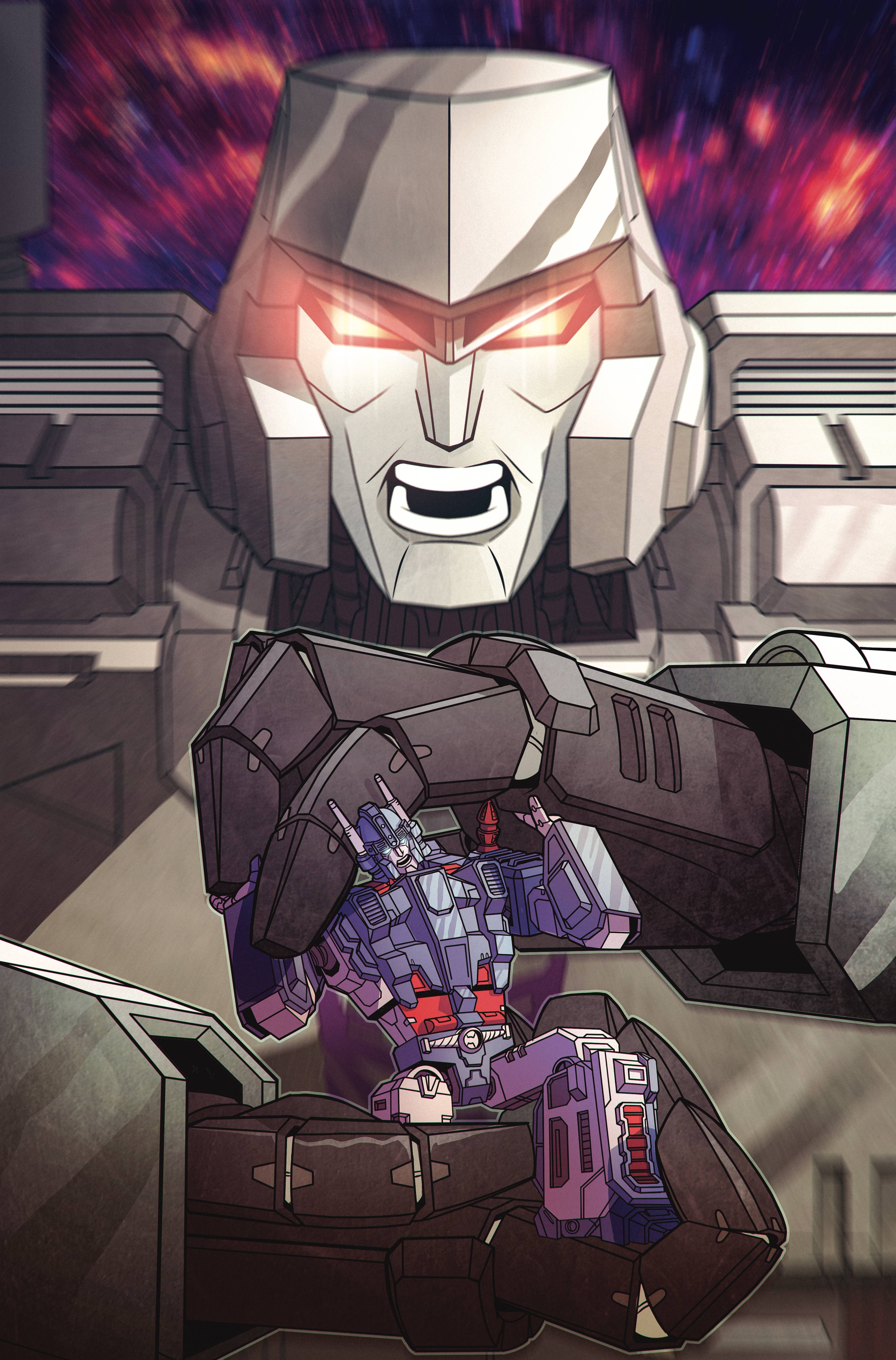
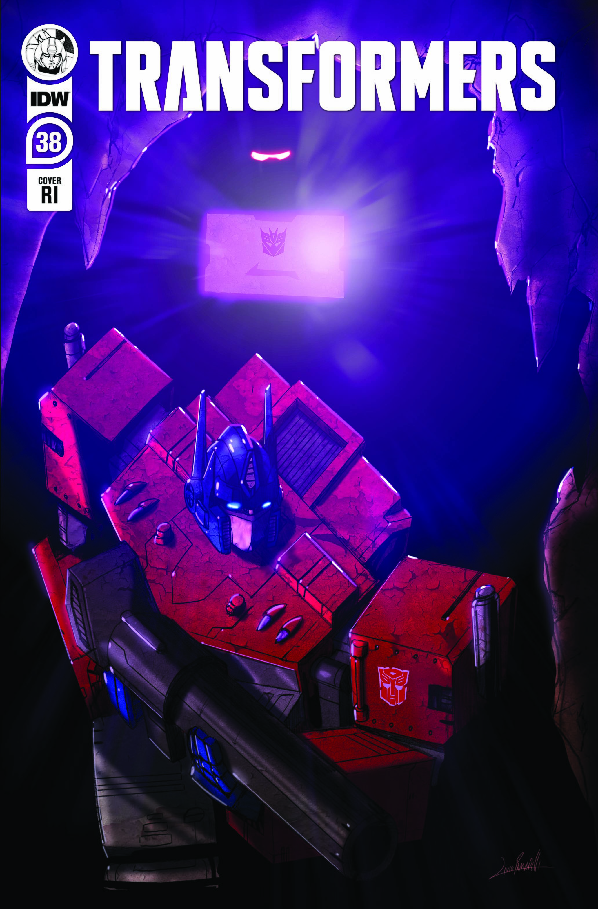
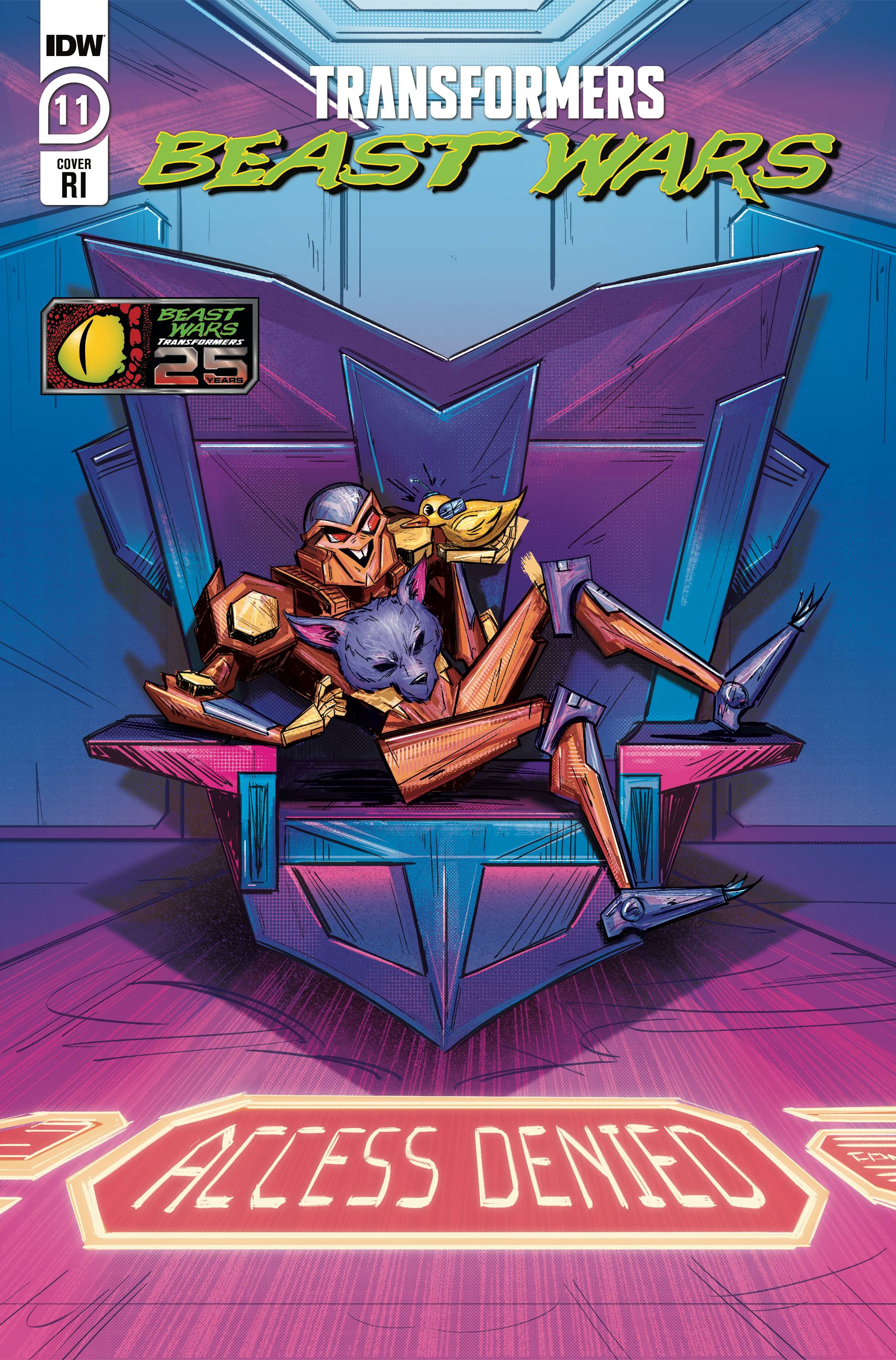
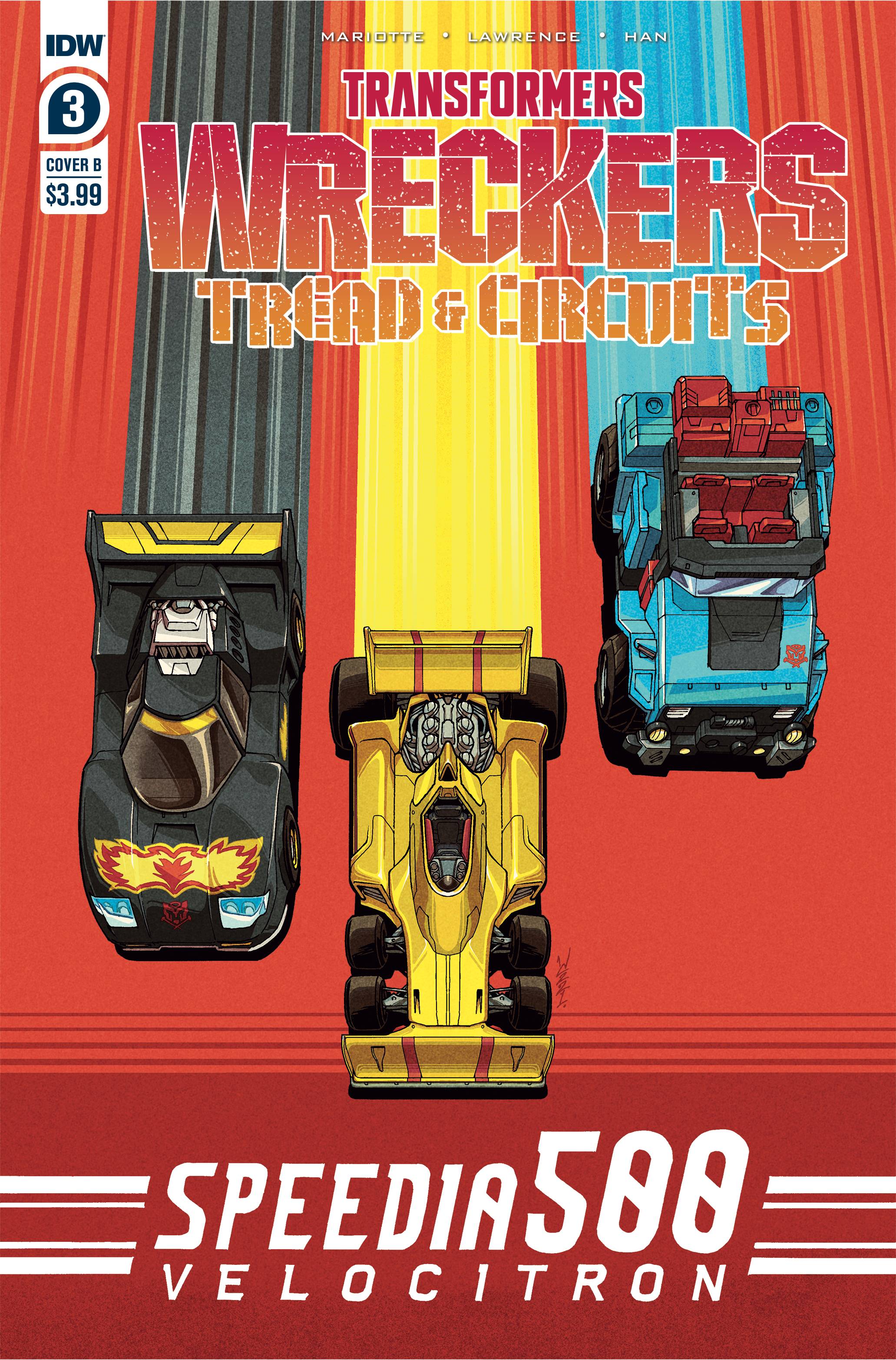
PREVIEWSworld expands our coverage of December’s incoming IDW Transformers titles by revealing artwork for several additional and variant covers:
- issue #38: B by Chris Panda, RI by Livio Ramondelli
- Beast Wars #11: A by VenBlu, B by John Yurcaba, RI by Brenda Chi
- King Grimlock #5: RI by Stephen Byrne
- Shattered Glass #5: B by Guido Guidi
- Wreckers — Tread & Circuits #3: B by Winston Chan, RI by Casey Coller
Sound off on the 2005 boards!


AzT
https://twitter.com/brenda_cheese/status/1474454376743792645
T-Hybrid
This is what I missed in the issues where the "new" art style was used.
It was highly detailed, but it didn't feel like the added detail contributed anything beyond "yep that looks more like the original."
There was too much on the panel, similar to some of the mainline IDW TF stuff. It would make great cover art or one-off pics, but when I'm trying to read my eyes were too swamped with all of the details on the page.
It's similar to the Bayverse stuff. It often looked GREAT in static shots and action figures. But in motion it was often a cluster of metal.
I dunno what the middle ground is, but my preference is towards what we've got now. Maybe something closer to "the original" but without such fine detail? It's like how some people feel about "greeble" on modern Generations figures.
T-Hybrid
It's positioning itself as a potential "finale" arc of sorts, presumably because at the time they didn't know if they'd get beyond 12.
Lotta pieces in play though if it's allowed to run another 12.
prfctcellrulz
Getting back on topic, what happens in Beast Wars…Holy Primus…
Shin Densetsu
Any artist who has their work published on a monthly basis likely is receptive to constructive criticism and has thick skin. If any of you are tired of reading criticism, do yourself a favor and either gloss over those posts or put the members who post them on your ignore list. Don’t waste your time nor the staff’s time by reporting said post or any post where you’re losing an argument either. Artists know not 1 artist has universal appeal since preferences for art are subjective.
For those of you providing criticism, so long as you’re respectful and not breaking any rules here, there’s nothing to worry about:
TFW2005 Rules
Any further discussion about this should be taken to PM but there’s little more to add beyond this post.
Rodimus Prime
You realize that it isn't a simple black and white situation, right? People can find it lacking, but want to support it in the hopes of it improving. Constructive criticism is a thing. If they did stop reading it, but complained about how it doesn't seem to have improved, you'd just tell them that they are not allowed to complain about it because they don't buy it. In reality, you just don't want any criticism of the things you like.
I think @Josh made a valid response about the amount of work he has to do versus most artists. If he was free to focus on simply drawing the scenes, I am absolutely positive he'd change/add things. Not only to make fans happy, but to please himself as well.
T-Hybrid
Like, seriously, if there was a machine that kicked me in the dick every time I gave it $4…the solution isn't to start yelling at the guy who invented it after the 10th time it's kicked me in the dick.
Rodimus Prime
I like how you didn't bother to read @SPLIT LIP 's post and assumed he was complaining about the art as well.
T-Hybrid
I don't recall electing you my spokesman.
No, it just tells them nothing you complain about actually bothers you all that much because you're still handing your cash over month after month.
…so stop buying it? Seems like an easy solution.
This comic's been going for nearly a year and people still haven't been able to move past the art style complaints. It's fucking tiring. You'd think you'd get bored of being so mad all the time and go find better ways to invest your energy.
Josh
Much like animation it's simplified for time and ease of repetition, and I think I've mentioned before that I'm treating my take a lot like an animated series as far as level of detail and stylization. That's not necessarily specific to this series in particular but just in general how I like to tackle drawing/design. I look at a lot of animation and storyboards to help inform how I tackle design AND panel composition. (I also look to older eras of comic books because there was an ease of readability in the simplicity of their own layouts/composition).
I dunno. It's effectively my visual take on the brand and I'm just thrilled to be here. There'll always be chance and opportunity for a different series down the line that might be more to your liking. But until then!
Bass X0
You can imagine Ultra Magnus to have a normal face before someone takes his face.
Rojixus
No skull-face yet!
Nova Maximus
No Skull-face.
![[IMG]](https://cdn.discordapp.com/attachments/809631133117579284/923227405206827028/unknown.png)
Garbage.
Bass X0
You’re a good colourist Josh. I won’t let anyone say you’re not, but when you don’t even bother to draw the rings around Waspinator’s eyes, something is critically wrong. You know he’s supposed to have this extra layer to his eyes, and you know readers know he’s supposed to have the extra layer. Without them, his eyes just look wrong. It looks bad. There’s simplifying a design and there’s just plain not putting in the effort to do the most basic of things expected by readers. We are not little kids here who don’t know better, which this art style is clearly aimed towards.
If you want to draw books for little kids, that’s perfectly commendable and to be respected. This art style is perfect for them. But a 25th Anniversary Beast Wars book aimed towards fans of the show who were kids and teenagers themselves in 1996 just isn’t the target audience this art style is for. And yes, that is who the book should be for. Someone put you on the wrong project, that’s all we’re griping about.
You’ll be here for all of the remaining issues? Given the poor sorry state the whole of IDW is in, that’s another two issues I’ll guess?
Josh
You're comparing apples and oranges here, buds. Two different art styles and two completely different types of scenes. But armchair away")
I'd be happy to break down my choices on the page, if anyone cares to be civil enough to hear it. But I stand by that page. Could somebody do it better? Oh, very likely. I dont consider myself a master of storytelling by any stretch, I'm always learning (much like anyone else in the game!). But I think the storytelling is solid enough to get the necessary visual information across. That last panel specifically, I pulled in tight on purpose. The emphasis is on a sense of urgency and to focus on their expressions. I let the art work alongside the text so you can understand the overall action that's taking place (this is comics after all, where words and pictures meet!), and yes I use blackarachnia's expression to speak to her character (because yeah, she'd be more angry/annoyed that waspinator is even touching her vs a genuine surprise type of expression, like scorponoks), and the major action of them being ducked out of the way is made clear with the very next panel on the next page because this page/sequence doesn't exist in a vacuum.
But yeah, my page vs a few robots standing in a room talking ¯\_(ツ)_/¯
Like, I get you're trying to legitimize your dislike for my work but come on. At least be fair about it
There's things like the actions being conveyed, panel counts, not to mention time restrictions/deadlines. I have to maintain a page a day starting from layouts all the way through pencils, inks, AND color (all in that one day.) Which, if you dont know, is very much uncommon in comics. But I digress!
You don't like it. I think we might be starting to get the hint ;P
Anyways, I look forward to hearing your thoughts on the next issue! And the one after that. And after that. And after that.. etc etc. Because I'll be there for all of them ;3
SPLIT LIP
I will admit, side-by-side like that I can really see the criticisms about shot composition and staging. Were it not for Waspinator telling everyone to get down…I’m not sure I could tell what that last panel is. Three characters clustered together so close you can’t make out what they’re doing, and then you have Terrorsaur off flying by himself. It almost looks like Waspinator has picked up Scorponok and Blackarachnia and flown off with them along with Terrorsaur. Blackarachnia looks angry, not surprised, making it even more like Waspinator has grabbed her rather than pushed them all down.
I also think it’s a it odd that Waspinator’s mouth doesn’t move at all. It makes him look like he’s got a perpetual grin.
Megs
Good God. That really puts it in perspective how much better the art should and could be. Insane.
Bass X0
Compare the difference between the two artists on this book. As an adult fan of the original TV show, I could write paragraphs about which one I prefer more and why it is worthy of representing the 25th anniversary of Beast Wars, and I already have done in the issue discussion threads here. But instead, this time I will let the quality of each artist and their character designs speak for themselves.