


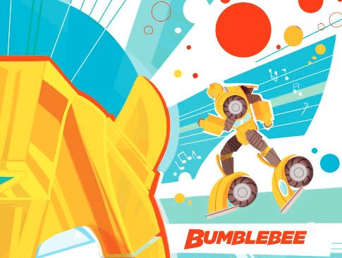
iTunes and IDW bring us a preview of Transformers Bumblebee: Go for the Gold, written by James Asmus with Marcelo Ferreria (Artist), Maria Keane (Inker), Valentina Pinto (Colorist) and whose Nicoletta Baldari cover art we featured in November.
When his team’s in danger, Bumblebee comes to the rescue in this fun adventure that pits the Autobots against Starscream’s evil Decepticons!
Check out the panels attached to this post, add this one-shot to your pull list at your preferred comic shop and then share your thoughts on the 2005 boards!


fishpop
Is this comic part of IDW 2.0?
batfan007
Fair comment on the visuals, but you are kinding of looking past they they had female voice actors and there was no doubt that they were female autobots. I don't know who decided Arcee's color scheme, but it was clear they went with a stereotypical girly-girl archetype, rather than the resistance fighters/soldiers of "The Search for Alpha Trion" episode.
The main reason they have more human like features (and not boxy) is that they were designed by Floro Dery, and he prefers humanoid/spherical type figures rather than say super robots (anything big and boxy) and even said in some interviews if it was up to him, he'd make everything TF have those more human like body types and features. But it's hard to know if he was being serious or sarcastic when he said it. But looking at his other art, the only time he did square boxy stuff was by request for the Kohara redesigns, everything (such as 86 movie stuff and Pirates of Dark Water that he was left to design he kept to the more spherical humanoid shapes (Devcon, Sweeps, Galvatron etc).
All his production type art for the movie (full illustrations) is loaded with organic imagery and aesthetics.
Battle eRector
My trick is doing Google Rewards surveys for credit so I never pay for anything in the Play Store.
Scoff
If so, that's a really bad reason.
View attachment 28155311
This rubber ducky looks out of place, which works great if you were going for a comedic feel or if you were trying to create a visual representation of something looking out of place.
If you weren't trying to do something like that and/or was trying to invoke elegancy then it doesn't work and the rubber ducky becomes an intrusive element because it's contrary to what you were trying to accomplish or invoke.
Or to use a different example:
View attachment 28155318
Sue sticks out like a sore thumb here and it's a panel that has received a lot of attention over the years but not for its intended reasons. It's attention but it's not positive attention.
When I look at the group cover, I'm supposed to think: "Wauw, this looks badass." but what I actually think when I look at it is: "Wauw, Windblade looks really out of place and it's kind of intrusive."
Yes, I remember the cover and Windblade's design did attract my attention but it wasn't positive attention and so I don't associate her inclusion in it with anything positive and would rather she not be included in stories featuring the G1 cast with their original designs because I don't think it would look good based on what I've seen.
Megastar
Guys, have you ever thought the reason Windblade "sticks out like a sure thumb" is too attract attention to her?
Scoff
Really? I'm tempted to give it a read but unfortunately, I'm almost completely broke at the moment. I think I'll add it to the list, though.
Scoff
I've been tempting to try my hand at this as well. Could be a lot of fun.
SPLIT LIP
Part of me wants to actually try and do it myself. There must be some way to keep her identity without making her stick out like that. She just so clearly doesn't belong.
Battle eRector
I got this on Google Books. Fun read but not as well written as Win if you Dare.
AzT
IDW Publishing on Twitter
Transformers: Bumblebee: Go for the Gold! – IDW Publishing
Lucas35
Tfwiki says that the comic is already out but itunes says it has not left yet. Does anyone know which one is right?
Scoff
It's interesting that the original design for the female Autobots wasn't androgynous but it wasn't actually that curvy either: the characters were "flat-chested", for example. The outward-shaped meant to resemble a bosom came later with Arcee's design, which sort of became the standard design for female characters, except when the blatant breast-shaped chestplate was used instead, like it was with comic Windblade and famously with Beast Wars' Blackarachnia.
It's contributes to one of the things that I really like about the Slash toy. The design is very faithful to the original G1 female design sans a few details (like the absence of lipstick) so it ends up feeling very authentic as a result. I could easily imagine Slash being animated alongside the other characters on the old show and not sticking out in the slightest.
I can't say the same for Windblade: I can't find a picture of it but there's a cover where she poses alongside the post-movie G1 cast (replacing Arcee) and it's pretty obvious she's not from that continuity. It looks like she came from another franchise entirely.
AzT
https://www.idwpublishing.com/wp-co…Transformers_Bumblebee_Go_For_The_Gold-pr.pdf
Purple Heart
Exactly. When we first heard she was going to be a repaint of Higbbrow in Titans Return, I thought she was going to straight up be a repaint of Highbrow with new wings and head, but instead we got a beefier version of the same design. Granted, that is my favorite Windblade figure, but I would prefer a more squared G1 version. And personally? I’d prefer for it to be more androgynous.
Scoff
Yeah, I don't know why they are so afraid to give her a re-design. It's the thing that bothers me about her because like you said, she sticks out like a sore thumb. It honestly also makes her design feel uncreative after a while because it's always the same with only a few minute details.
I get that she's a "fan-made" design but most of the things that's distinctive about her (like her hair-do helmet and make-up) wasn't part of the voting and the things that was voted on (like her jet mode) could still be incorporated into the new design. It's not as if she'd be unrecognizable as Windblade.
Lucas35
The comic is using the designers of Masterpiece figures and then Combiner Wars Constructicons.
Purple Heart
I love Bumblebee’s design, but they seriously need to come up with a more G1 design for Windblade because she keeps sticking out like a sore thumb in these comics.
Lucas35
Transformers: Bumblebee: Go for the Gold! by James Asmus & Marcelo Ferreria on Apple Books