


And this weekend, another great artist shares more The Last Knight New Concept Art Images. Now it’s time for Furio Tedeschi who uploaded them on his website
Similar to our previous report on Josh Nizzi’s new concept art reveals, this time Furio Tedeschi updated his website with several new images we haven’t seen before and high quality versions of the ones we had previously reported here.
Great and interesting ideas and concepts which we are sure you will enjoy. Here you are some highlights:
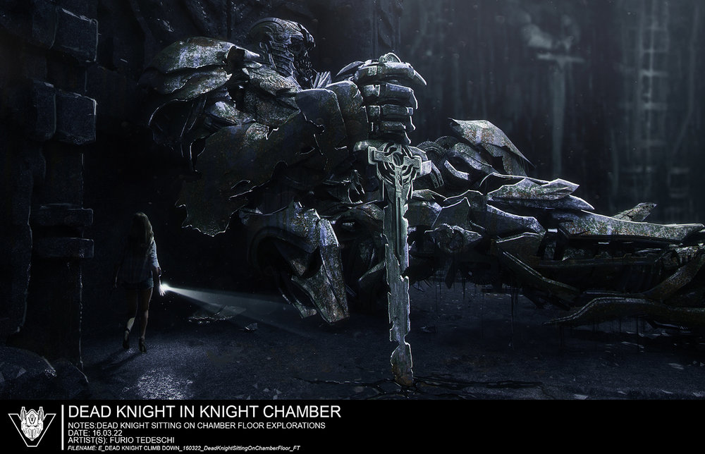
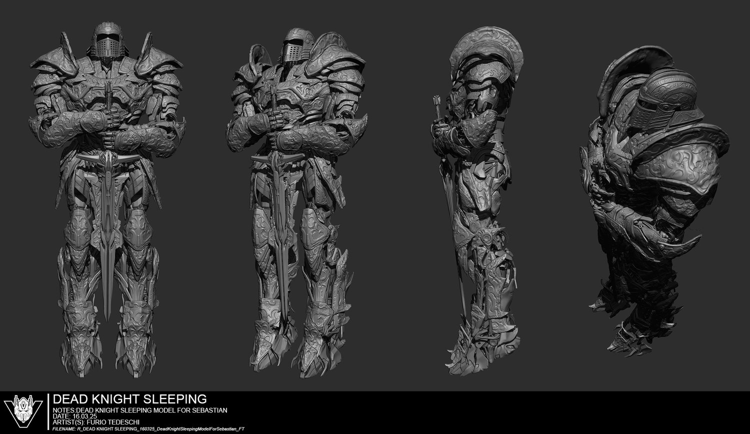
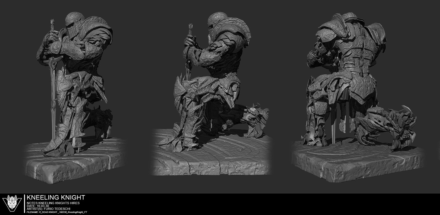
- Extra images of the Dead Knight, with better quality pictures of the ones shared before.
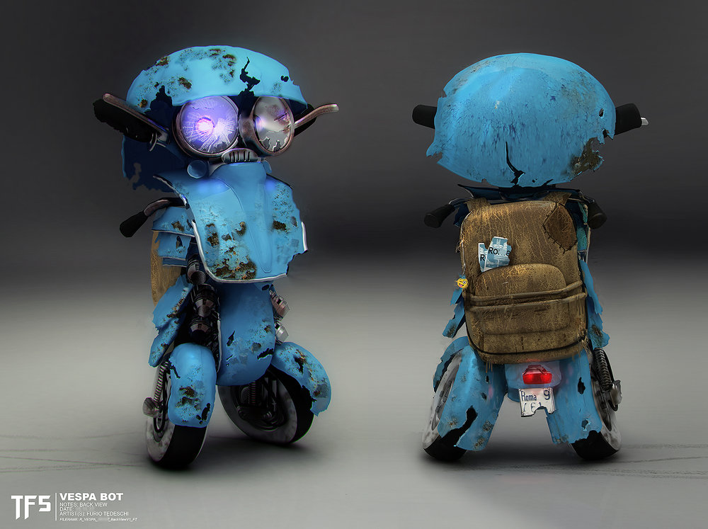
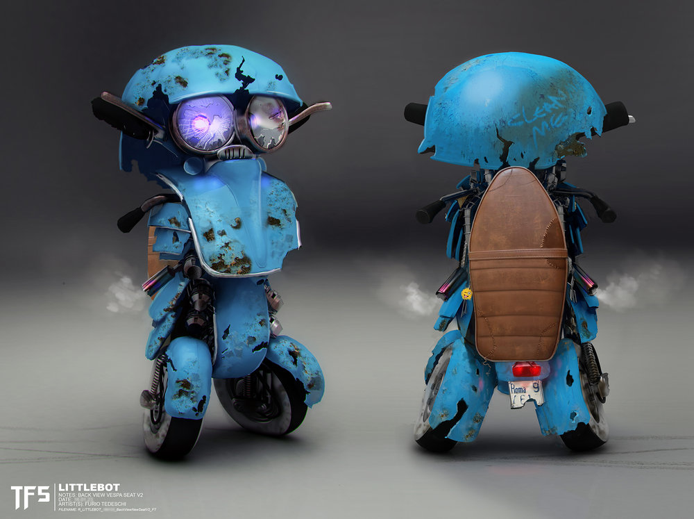
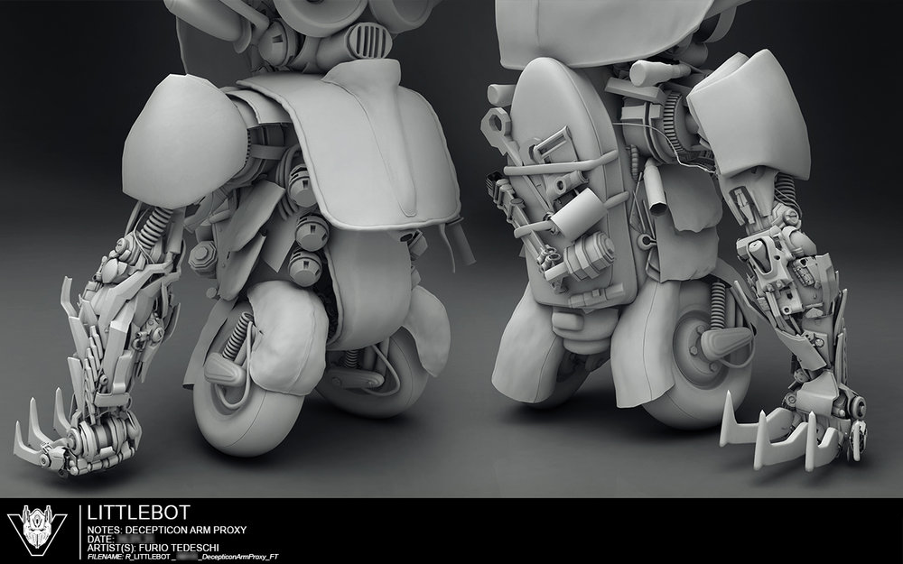
- Previous designs for Sqweeks who was named “Vespa Bot” before he got his official name in the movie.
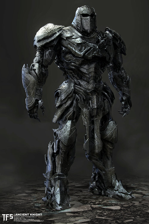
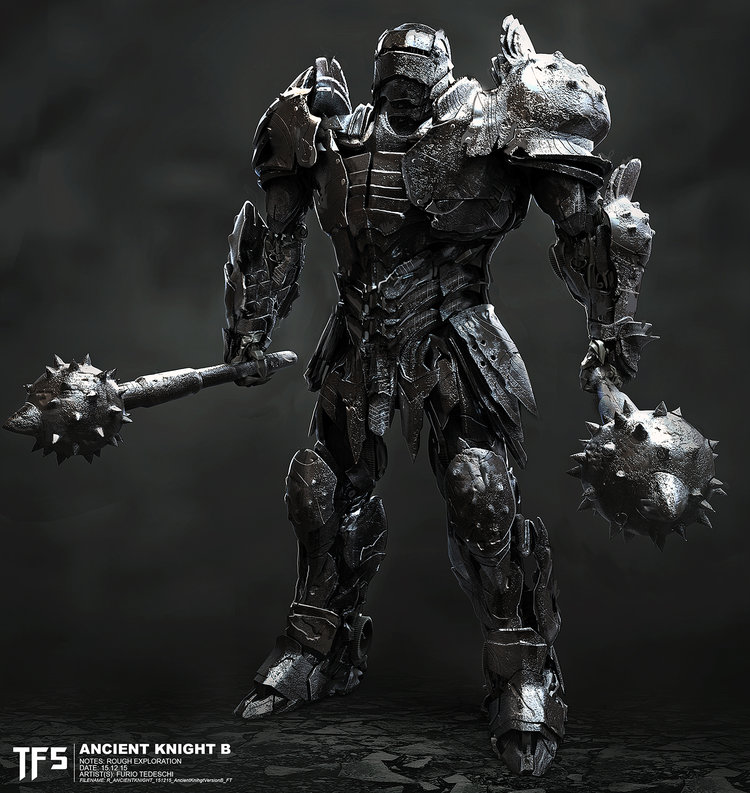
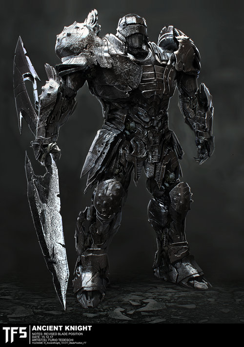
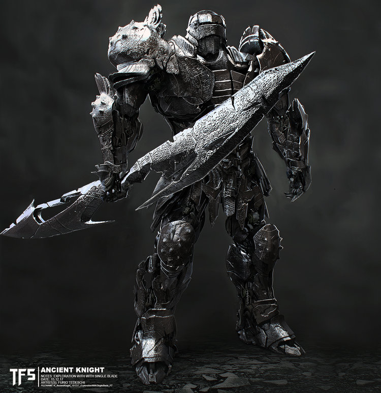
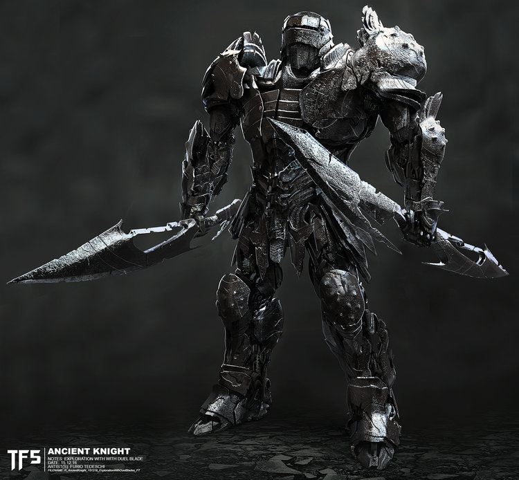
- Several angles of two new Ancient Knight featuring armor and weapons.
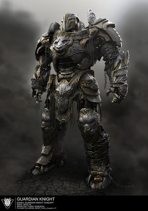
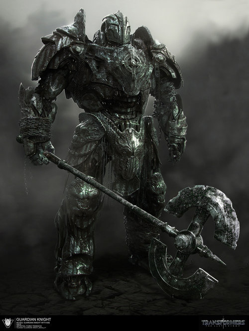
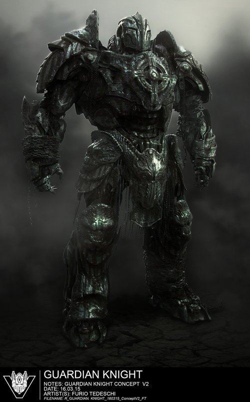
- Two new and massive Guardian Knights.
- Full body art of the Destroyed/Dead Knight which we know as Skullitron.
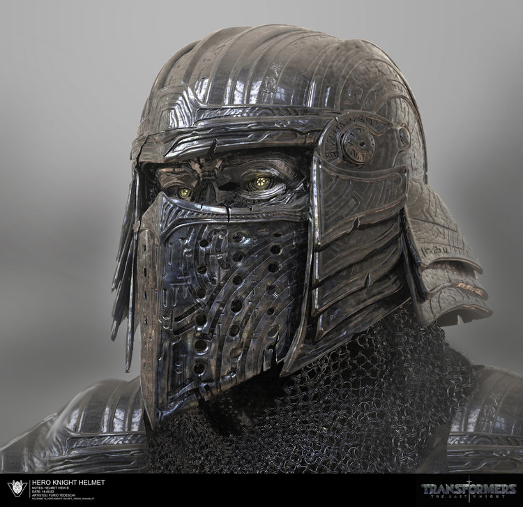
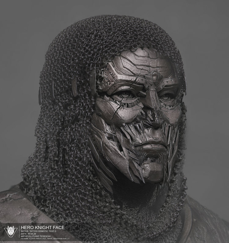
- Preliminary ideas for the Hero Knight helmet, head and faces.
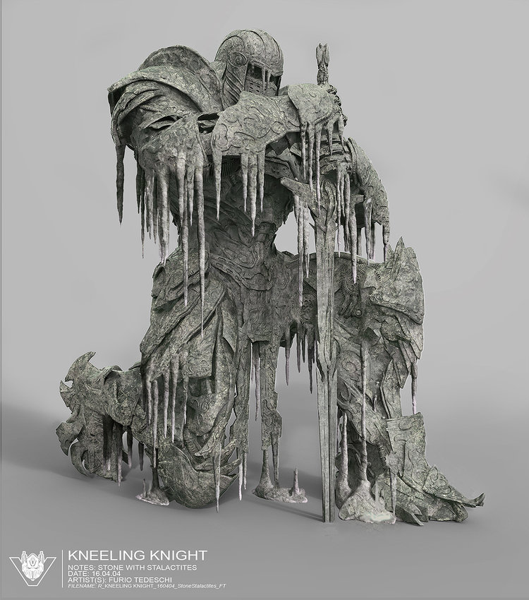
- Several views of the different Knight statues we saw on the film.
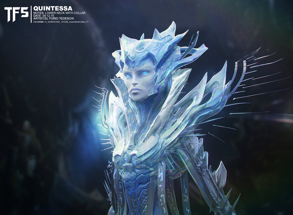
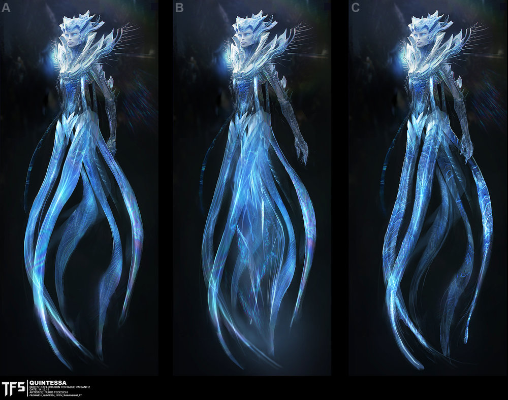
- An awesome concept art of Quintessa.
- Another preliminary design of “Side Kick” which later became Hot Rod.
- Early ideas of “Trader Bot” (Daytrader).
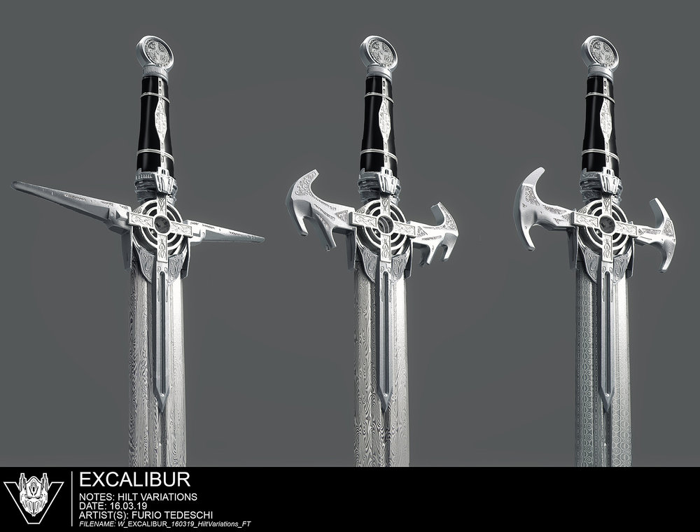
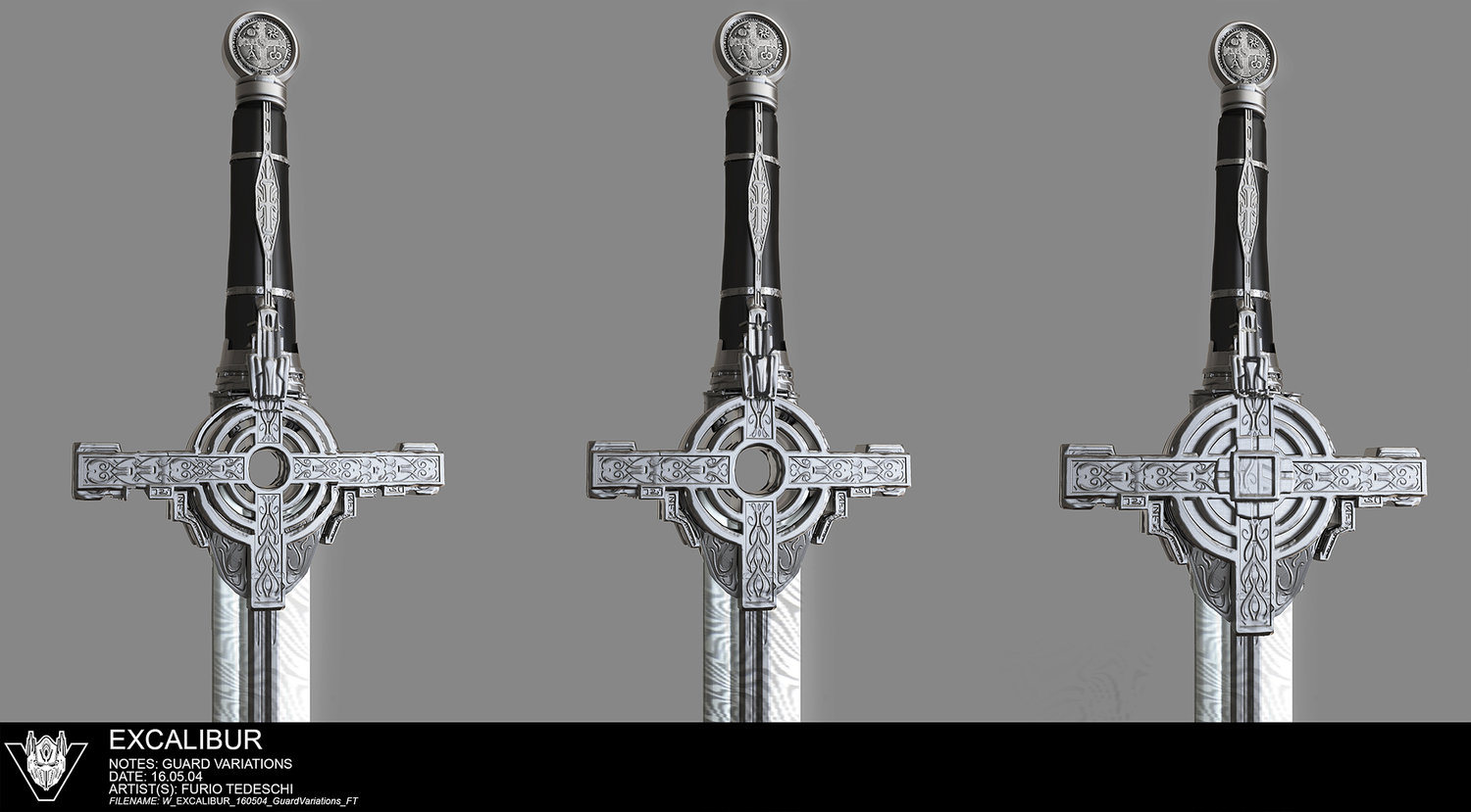
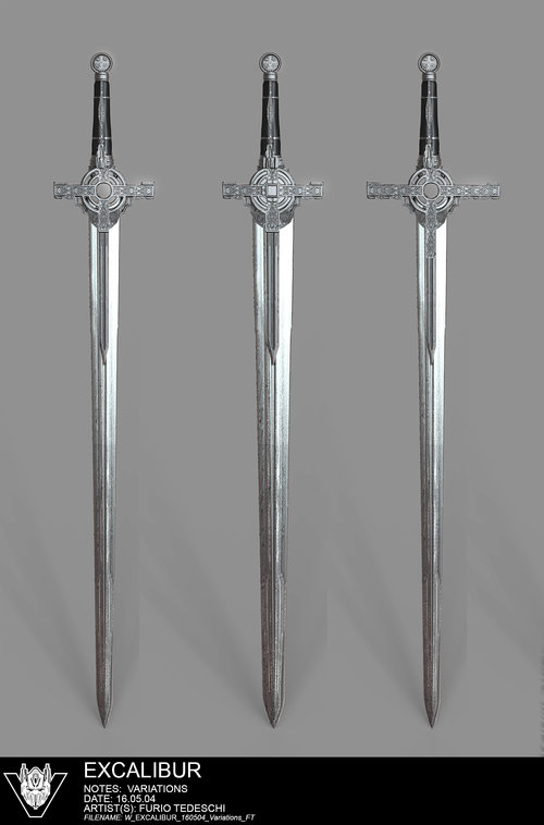
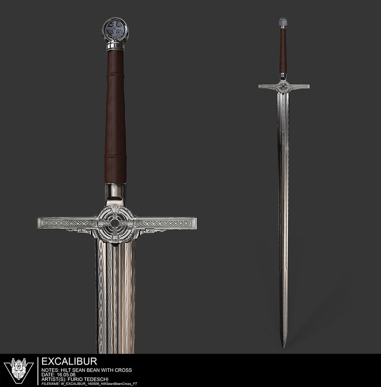
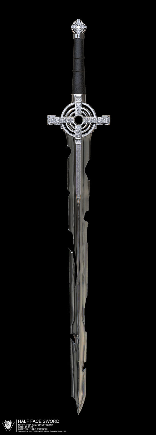
- A complete collection of ideas and designs for the powerful Excalibur sword.
- You can check out Furio’s concepts of Optimus Primal and the Snakebot if you haven’t seen them before.
Don’t wait more and click on the bar to see the mirrored images on this news post and then join to the discussion at the 2005 Boards!


sevenlima
Reminds me Sideswipe.
MrNiceGuy
Eh, try as I might I just can't see the Knights as anything other than possessed suits of armor. I mean, really. How hard is it? Sentinel Prime managed to look like a knight without NOT looking like a transformer.
Hot Rod is interesting, but without more Hot Rod-y colors, I dunno.
Quintessa I'm okay with in all her iterations. She's supposed to be a crazy God anyway, so I don't really care how she looks, and her being a vague Quintesson reference is enough for me anyway.
fishpop
That early Hot Rod has my colours!
![[IMG]](https://news.tfw2005.com/wp-content/uploads/sites/10/2017/12/The-Last-Knight-Concept-Art-By-Furio-Tedeschi-32.jpg)
SPLIT LIP
It says a lot that they never actually call him Hot Rod in these concepts. Just "side kick."
I feel like if he'd just been given a more human face and door wings that pointed up, he'd feel so much more like Hot Rod. They literally chose the least Hot Rod-y face they could out of all these concepts for the final film. Like seriously, why couldn't he have had that "Hero Knight Face?" That actually really looks like Hot Rod, IMO. Stick that face in Optimus' helmet minus the ears. And it especially kinda stings that G1 Hot Rod's head isn't incredibly original, and could've easily been alluded to with just the most basic forehead crest and brow chevron design, and they went for the one head that features a completely horizontal forehead shape. Like hell, most movie designs feature some kind of central vertical detail, except the one guy that should.
He should've just been called Hot Shot. He honestly looks more like him than Hot Rod because his face is more wide-eyed and his forehead makes me think of Hot Shot's visor.
Timothy.R
More proof that hot rod was just a name slap.
Sam’s_Bee
Oh what could have been…those knights are what I'd hoped for. That snake reminds of that prehistoric snake and that's freaking badass! Squeaks is adorable in an odd way and Quintessa I just can't figure out why I'm still "meh".
MythofBlackout
I actually feel the same way regarding Hot Rod, and I'm a pretty big fan of the movie aesthetics overall (less so what they came up with in AOE and some of the TLK than the first three).
The frustrating thing is that despite being annoyed by the complete lack of anything resembling a traditional Hot Rod, I enjoyed his character in the movie way more than I thought I would. He's nice, for lack of a better term, and enthusiastic, which is something sadly lacking in all the trigger-happy jerks that make up the vast majority of the Autobot ranks in all five movies.
AnonymousDwell
I know I'm biased, in that I'm not personally a fan of any of the movie designs. (Although, I have to concede, while I don't enjoy the movies, Optimus Prime's design in the films has grown on me just because of all his super detailed, intricate parts, which remind me of art my dad used to make for me as a kid of real world cars turned into robots, with bits and wires and gears and headlights all over them. It's a pleasant memory. So much so that I kind of want to buy that Wei Jiang evasion mode Prime now. That thing is all the cool.)
But every time I see this Hot Rod, I just cannot, despite my best efforts, and with all respect for and happiness for those who love these designs, suppress the immediate and irrepressible urge to exclaim, "Could they not have made him look like ANY Hot Rod we've ever seen in ANY continuity, at least a little!?"
I mean at least Optimus is, technically, a blue and red truck with windshield pecs. At least Megatron is silver/grey and has a giant gun. At least Starscream is a jet (though, on reflection, SS is another character that really does not pull from his source material anywhere near enough imo.)
But with Hot Rod, seriously, in what universe has Hot Rod EVER looked ANYTHING like this? I'm all for new and different designs, but SOME aspect of their distinctive likenesses from SOME previous source material, surely, would be desirable? I mean he has a spoiler… I guess. And some orange splashed on him. But… huh? Please? No? Just me?
Okay. I'll shut up now. Carry on. I'm not trying to bash the Bayformers, I'm really not. As always, I'm super happy they exist as they are an immense boon to the franchise, and I know they make people happy and people being happy = good in my book. I just… anyway. I shall zip it lol.
And I will say this is some absolutely gorgeous concept art, regardless of my personal tastes re: the design philosophy behind them. Seriously, beautiful.
Heliblade
What is it with early development Daytrader artwork being creepy?
SPLIT LIP
A lot of these knight concepts are way better than what we got. They're less generic knight and more, well, distinctive knight.
RobotKnight95
This whole knight-formers thing would have been interesting if it was Beast Wars inspired alongside being the main plot.
Chuggington
Am I the only one who sees a face in Day trader\'s stomach kibble?
NominusDP
Quintessa looks nice , plus the Knights look amazing (just wish the Dinobots , supposed members of this group got more screen time!)
grimtnt
that green and black hot rod/sidekick concept looks a lot more like lockdown than lockdown himself looked in age of extinction
Makes me wish even more that unique toys releases their lockdown in an animated colour scheme
Applejacktimus
I swear, every time I see Furio's name, this is all I can think of:
Also, is it just me, or does Sqweeks look like he's about to lay down the savagest roast of 2017 in this image?
"I may not have arms, but at least I can get a girl to ride on me"
zeeman03
the face of the red knight (every picture of the red knight has a different face)
View attachment 27864224 View attachment 27864225 View attachment 27864226 View attachment 27864227 View attachment 27864228 View attachment 27864229
Yohan PLMIXMB
Why a piece of the file name and date are blurred? (Squeeks Concept art)
zachprime86
All these awesome knight designs makes me wish we actually got good toys of them
zeeman03
i decided to make this View attachment 27863137 View attachment 27863138 View attachment 27863139 View attachment 27863140 View attachment 27863141
User_136440
Hot Rod’s face is a bit generic there, but I think I prefer it to what we got. We didn’t need another green robot though…