


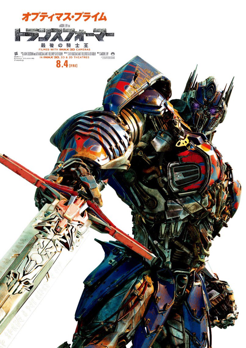
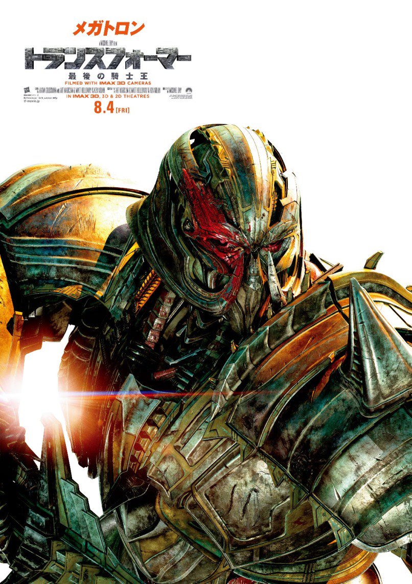
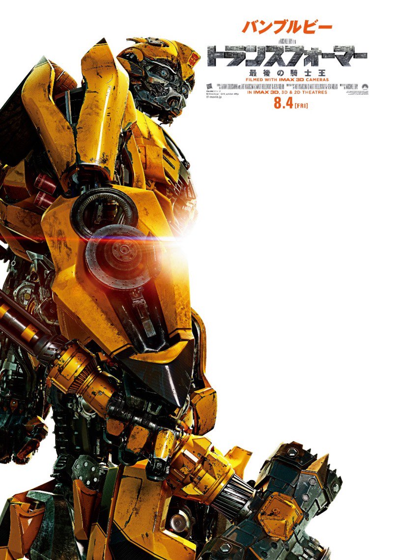
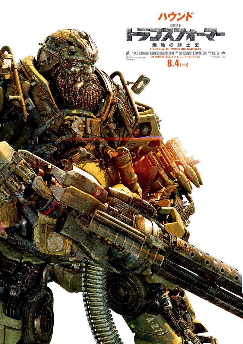
Via the official Takara-Tomy Twitter account: @TF_pr we have images of some new Transformers: The Last Knight Japanese Colored Posters.
These posters use the same art that we saw on black & white characters posters previously, but these ones are colored and with Japanese text. So far we have posters of: Optimus Prime, Megatron, Bumblebee and Hound. The Last Knight has just made its debut in Japanese theaters today.
You can see the posters after the jump. We hope more will be released in the future, don’t forget to click on the bar and share your thoughts at the 2005 Boards!


Chillyn
Haha normally I am also, but I don't like to ruin the magic… in the case of tf.
Do it! You can't go wrong at redbox. Scarlett J. isn't bad to look at either
John TheDestroyer
Yea, I'm the guy who watches every scene multiple times on YouTube, but when I do that I can find mistakes and bad cgi in every single one of the movies, not just Aoe and Tlk.
Haven't seen Ghost in the Shell yet, but I definitely want to. I might watch it tonight actually.
Chillyn
Yea, that's what had me confused because the criticism was on tlk. I've never had any qualms with the cg in any of the movies. I'm sure if I watched a sequence over and over frame by frame I could find stuff wrong or lacking.
The one thing about tlks branding that irritates me is the new logo. I hate the font and I think the texture and effects they use on it could have been better. I'm glad the visuals made up for it in the movie.
Speaking of awesome visuals have any of you guys seen ghost in the shell with that chick from marvel. Holy fuck! I just muted the movie and threw on NIN pretty hate machine so my eyes could have an orgasm without the dialogue getting in the way lol
John TheDestroyer
These are all examples from Aoe though. The cgi in Tlk was a big step up from Aoe in just about every way.
Chillyn
Damn you have a good memory! Lol. I'll see if I can find any of those scenes in the trailers so I can analyze it. None of this popped out at me, but I've only seen tlk once. If what you say is true then I give you props for such a discerning eye and embarrassing for me being an animation/media design grad. Lol
It's because it's been enlarged from a smaller 72dpi file. Good luck finding a hi res 300 dpi. They usually don't just throw source files out there, unless of course it's leaked
Wazdakka
Is it just me, or do these posters look a little bit grainy?
AOEGalvatronRox
Okay, maybe atrocious was a bit of exaggeration. It just seems like the CGI isn't up to par like it was in the first 3 films. In AOE, after Galvatron transforms and slides into some vehicles, it sort of looks like he's on top of the explosion, rather than causing it. The scene where Optimus gets shot from behind by Lockdown and we see his chest sort of "explode", the effects just look unfinished. Another scene is when Wembley and the other KSI workers are playing with the transformium. When the transformium turns into a gun in Wembleys hands, you can see the gun sort of move even though he isn't moving his hands. The CGI just doesn't seem to look as good as it did in the first 3 films, to me at least. It just looks unfinished in certain scenes.
Moy
We're just missing HotRods
Chillyn
???? Explain. What do you think is lacking?
AOEGalvatronRox
View attachment 27779920
Just noticed the anti-Dcepticon symbol on Hound's gun. The character models have impressive detail, it's just too bad the CGI has been atrocious since AOE.
primalxconvoy
In Japan, it's not that easy to print large posters cheaply and then find a frame large enough (although Ikea in Japan has poster sized frames for certain sizes)
Chillyn
Screw all that. Just grab an image and print on your choice of 11×17 paper. Kinkos is a cheap failsafe.
edit. ok i helped you guys out. I sized these and cleaned up the images. They won't be the sharpest res (100dpi was the best i could do), but it won't be that bad., and not noticeable at all from a distance.
For the ambitious:
After I reformatted the size, there is a bit of wasted space at the top. If this bugs you, you will need to crop an inch off the top, or however much you feel necessary. Also try to use the borderless printing option. If that option is unavailable you can leave the border if you want. I prefer the image going off the page, just give yourself a little bit of bleed when you crop.
I like matte stock heavy/weight paper but I think they would look good on glossy also. Ive seen the cinema mini/poster and these are damn near the same size.
Enjoy.
TF5 Print – Google Drive
@primalxconvoy….. this will help you out a ton. I'm not sure what kind of print shops you have around you but you don't need much for this. The quality isn't up to print "standards" 300dpi so its futile to go all fancy expensive with the prints. 11×17 frames are pretty standard at most places. Hope this helps
Livingdeaddan
I didn't hate it, but it's not very good.
Sanchimaru
Yeah, so TakaraTomy do not understand what is a product or advertising.
Way to release promotional images of a movie the very day it hits the cinemas. It's not like it contains spoilers or anything… they should have released these months ago.
They are beautifully done, that's the problem: these would have been very nice advertisement.
Conversely, at this point it would be cool if they released just the images of each character.
Shizuka
Just to let people know, the orange text are the characters' names unlike the English posters.
primalxconvoy
Just to let people know that, you can\'t actually buy such posters, for your wall, in Japan. These are digital only. If you want an actual, poster sized image, you would have to track down an old poster that was used to promote the film in a used goods shop. You can, however, get free flyers in most cinemas, that are basically mini posters.
Justice for megatron
All four of them don\'t get the screentime they deserve
bman29
Not only do they get the better paint apps on figures, but posters too?!? I'm…I'm not mad, just disappointed in you Hasbro/Paramount.
primal789
And what did u think about it?
TFXProtector
…wow.